Familiar luxury codes
Many premium fragrance brands rely on similar black packaging, gold details, ornate typography, and generic luxury messaging.
Self-Initiated Brand Concept · Identity · Packaging · Campaign
A self-initiated brand identity, packaging, and campaign system for a contemporary fragrance house inspired by the transition between daylight and night.
Vespera is a self-initiated concept project created to demonstrate my approach to brand strategy, visual identity, packaging, art direction, and digital execution.
Overview
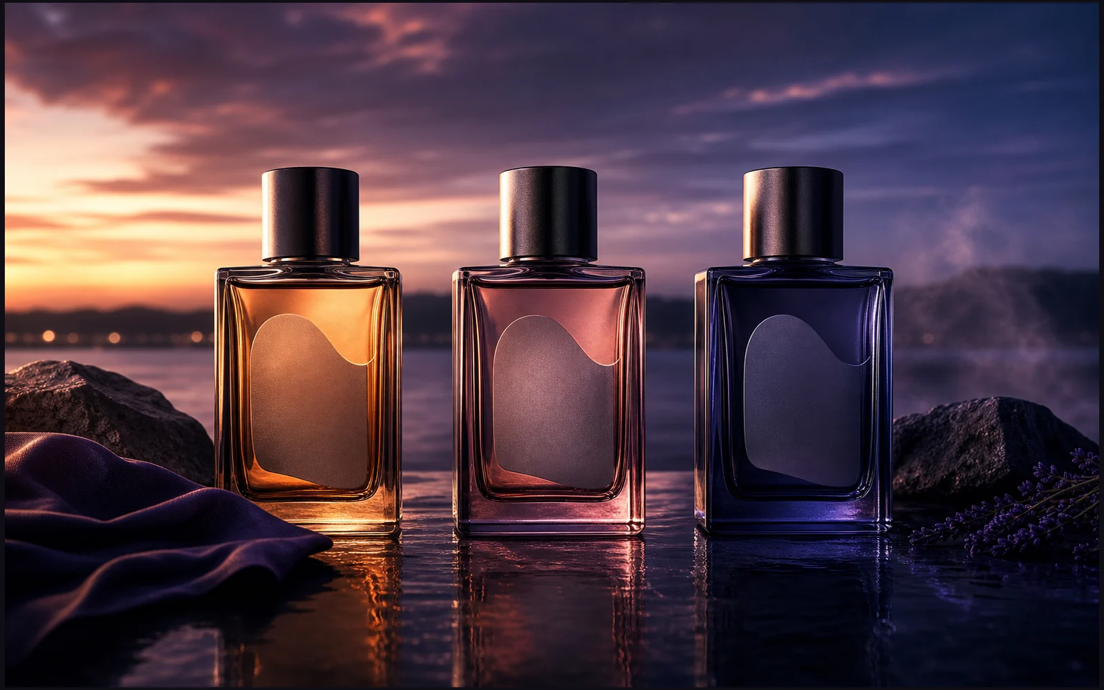
Vespera is a self-initiated contemporary fragrance concept inspired by the transition between daylight and night. The project explores how a fragrance identity can communicate mystery and emotional depth without relying on predictable luxury design conventions.
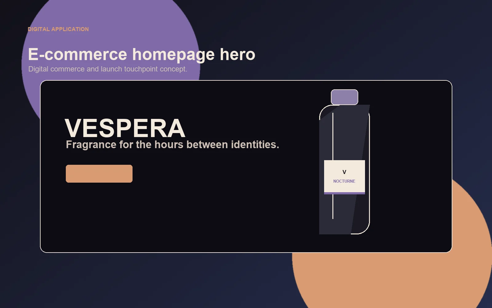
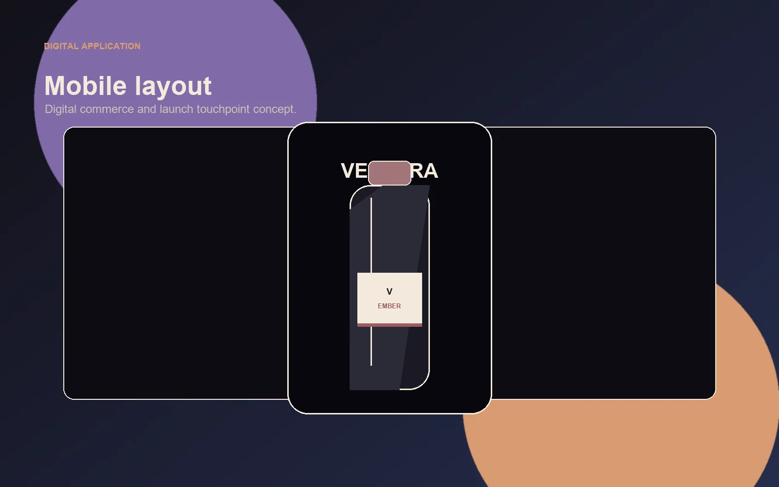
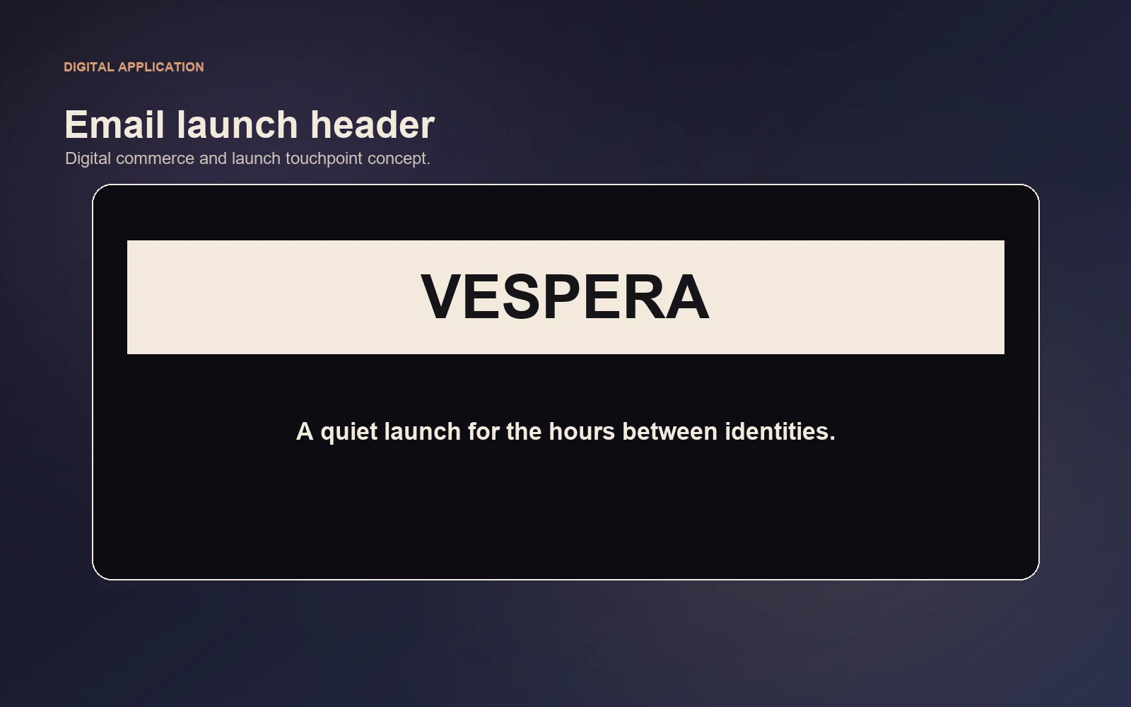
The identity was designed as a complete visual system across packaging, campaign imagery, social media, and digital commerce touchpoints.
Challenge
Many premium fragrance brands rely on similar black packaging, gold details, ornate typography, and generic luxury messaging.
The concept needed to feel atmospheric and premium without becoming ornamental, excessive, or visually predictable.
The system needed enough flexibility for three fictional fragrances while keeping the collection recognizable.
The intended audience is design-conscious customers around 24 to 40 interested in niche fragrance, fashion, art, music, interiors, and cinematic visual culture.
Creative Direction
The creative direction is based on transitional light, reflection, shadow, softened gradients, restrained typography, and negative space. Vespera should feel as though it exists between clarity and mystery.
The system uses material contrast, subtle color transitions, reflective glass, controlled shadows, and cinematic image composition to feel mysterious, refined, sensory, modern, intimate, restrained, and slightly surreal.
Naming
The name was selected because it feels elegant, memorable, and appropriate for a brand centered around transitional hours. This is a concept naming direction and does not claim trademark availability or legal ownership.
Fragrance Collection
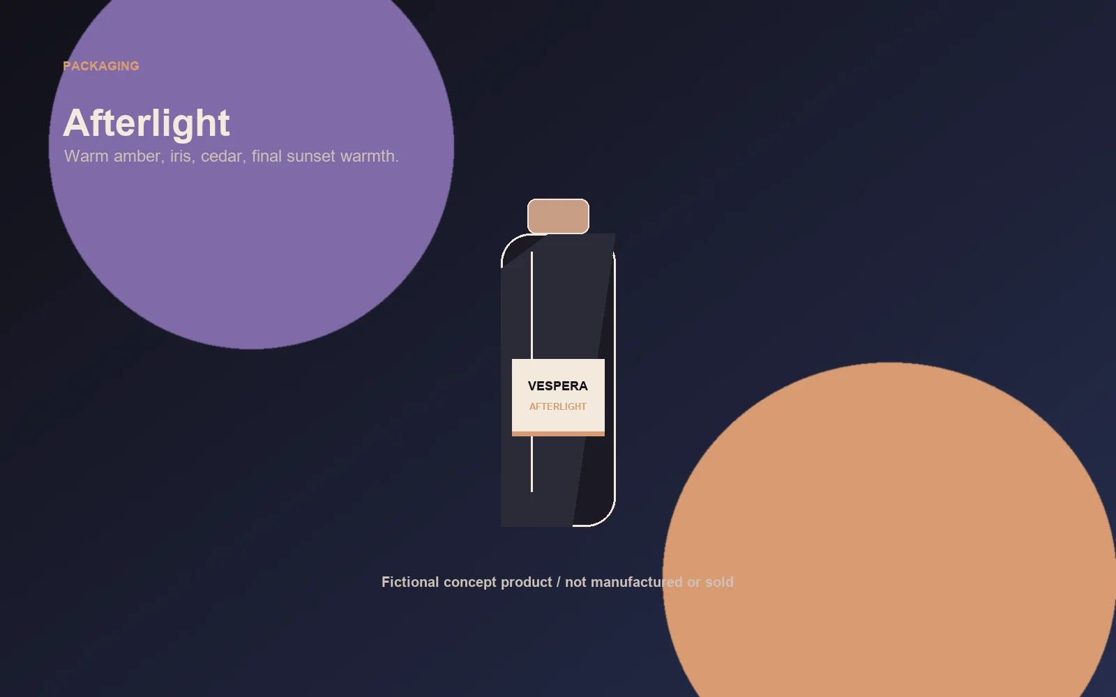
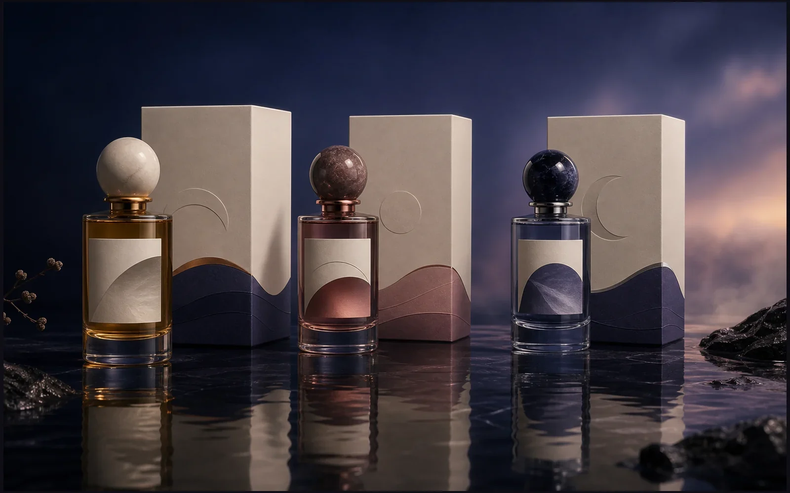
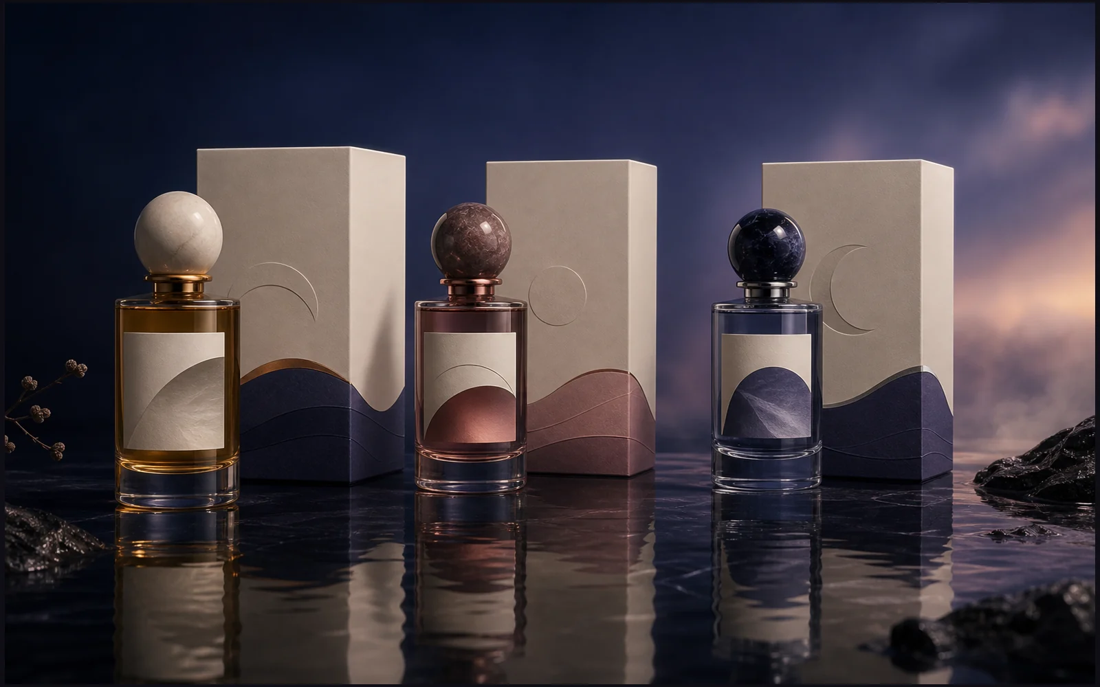
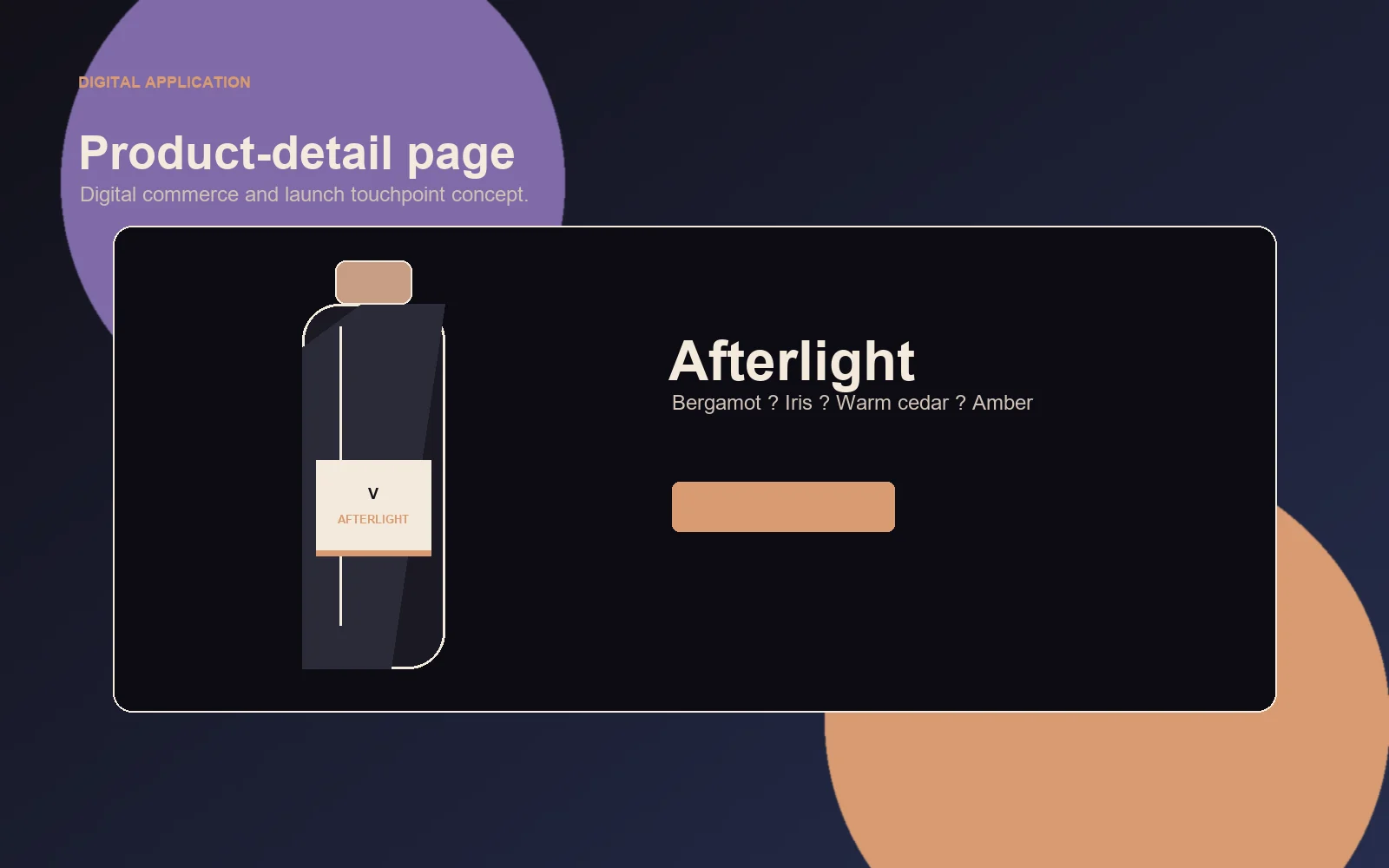
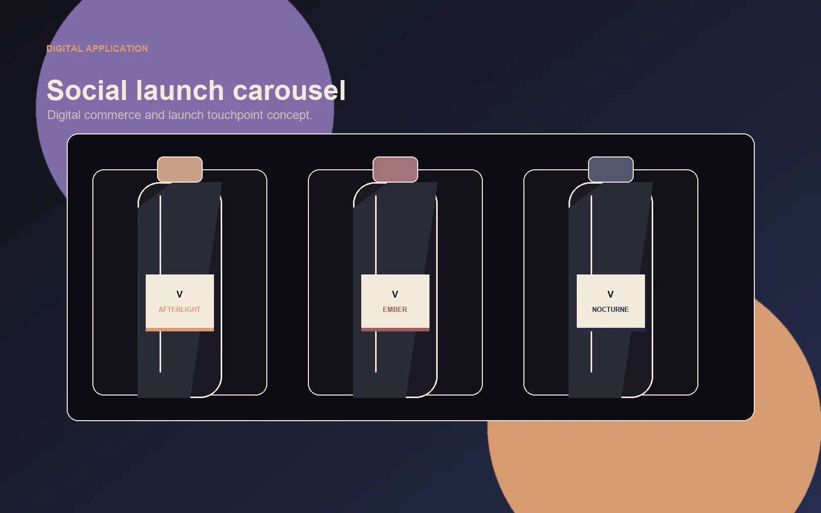
A luminous fragrance inspired by the final warmth remaining after sunset. Suggested notes: bergamot, iris, warm cedar, amber.
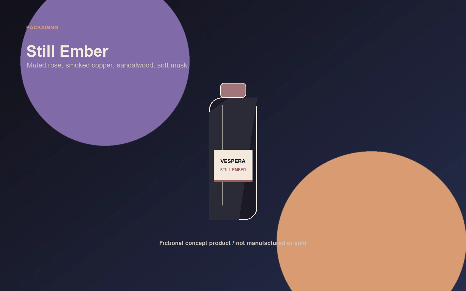
A warm and intimate fragrance inspired by fading heat and quiet interiors. Suggested notes: saffron, smoked rose, sandalwood, soft musk.
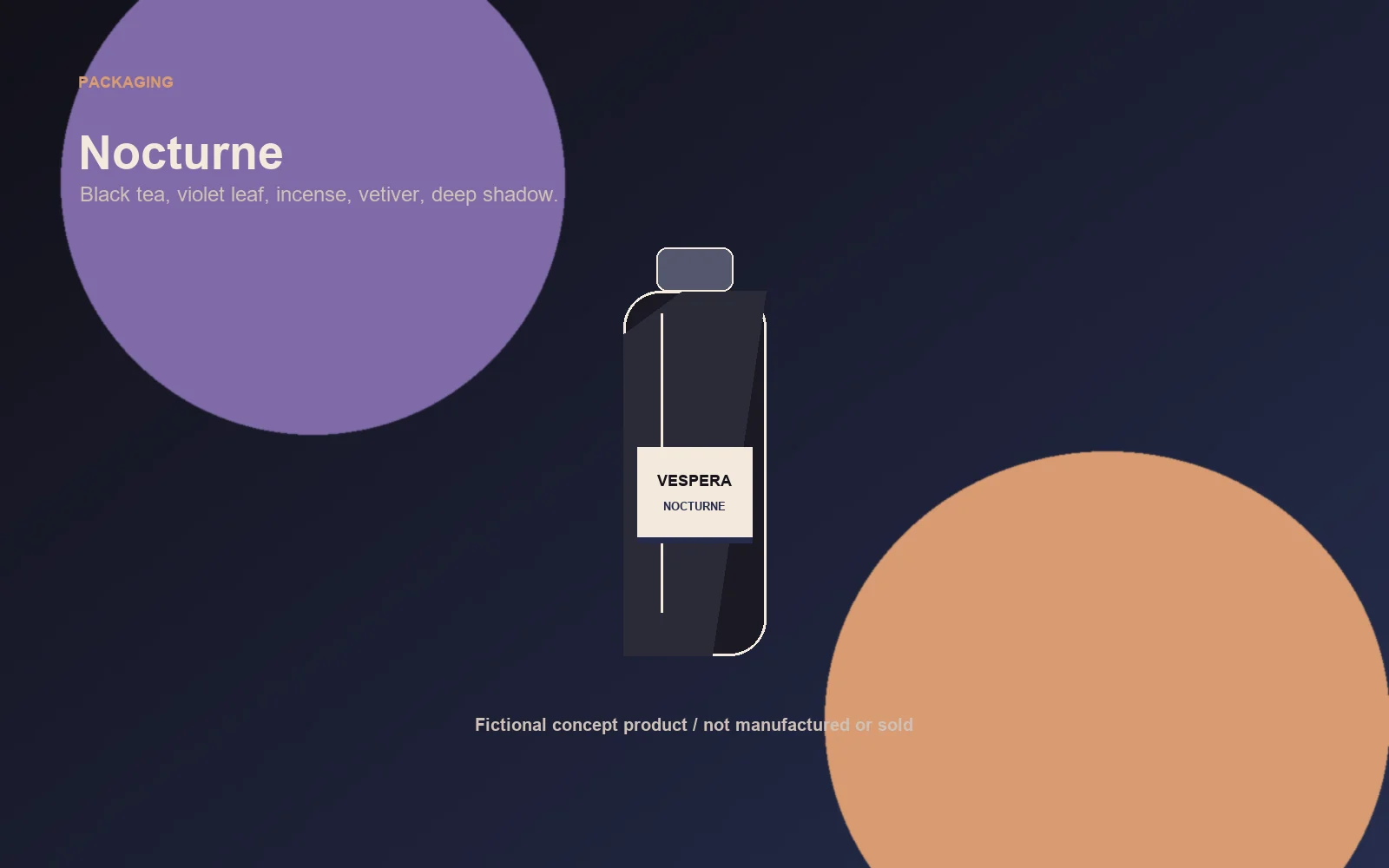
A darker fragrance inspired by night air, reflective surfaces, and deep shadow. Suggested notes: black tea, violet leaf, incense, vetiver.
These fragrances are fictional products inside a concept project. They were not manufactured, sold, tested, or launched.
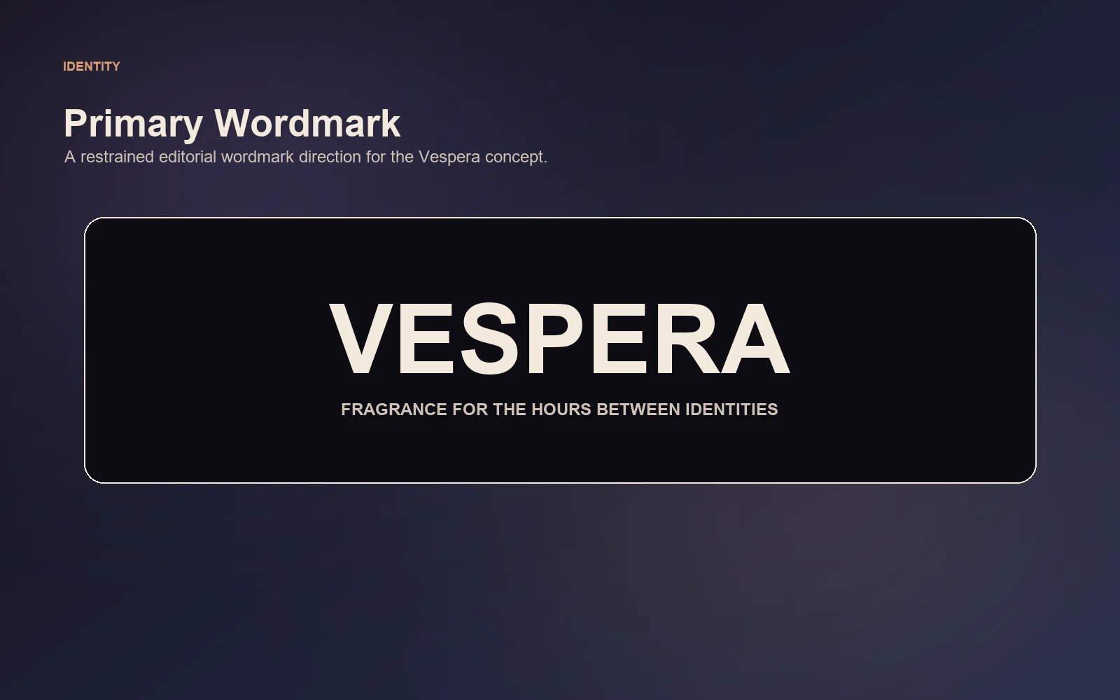
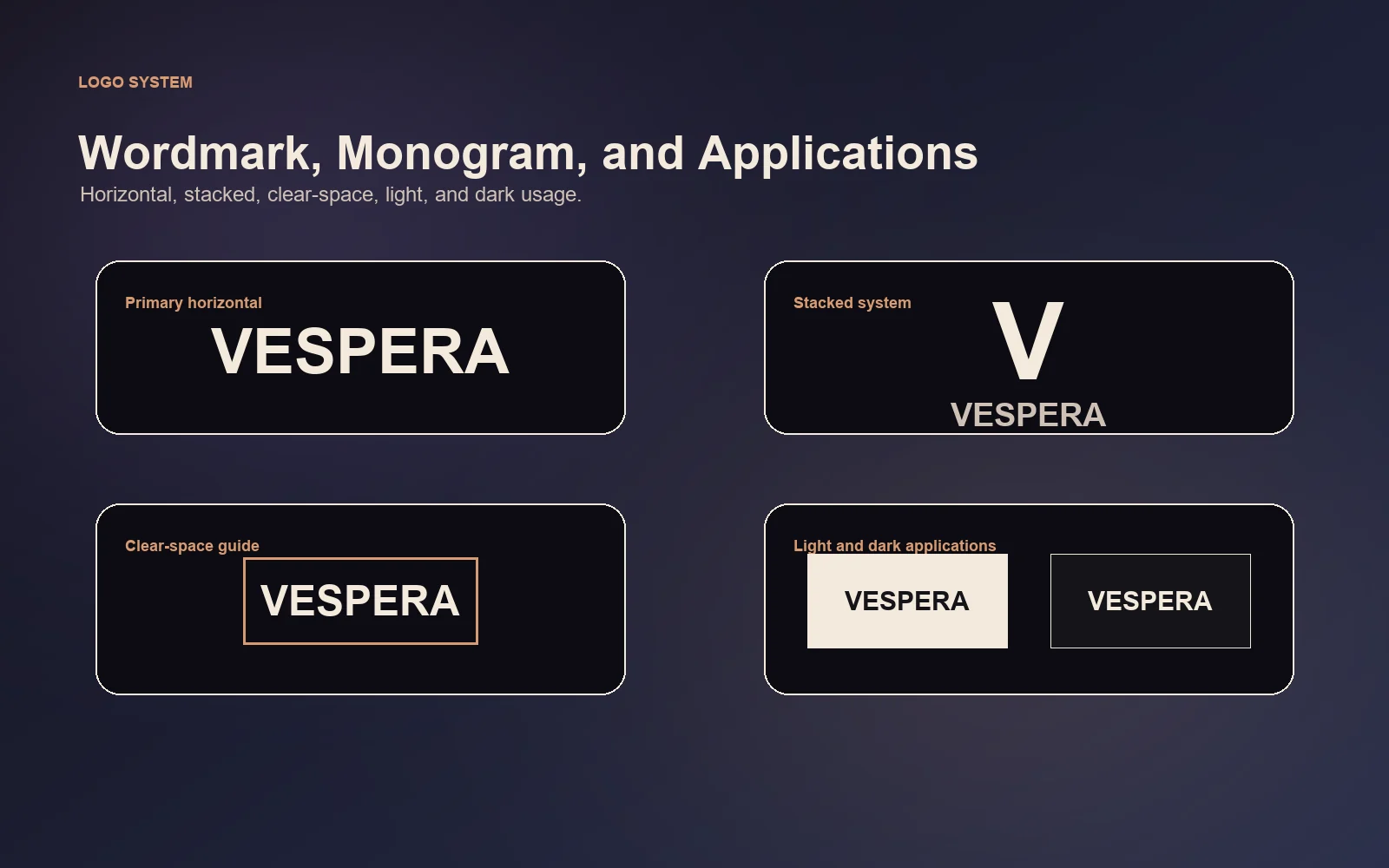
Logo and Monogram

Color System
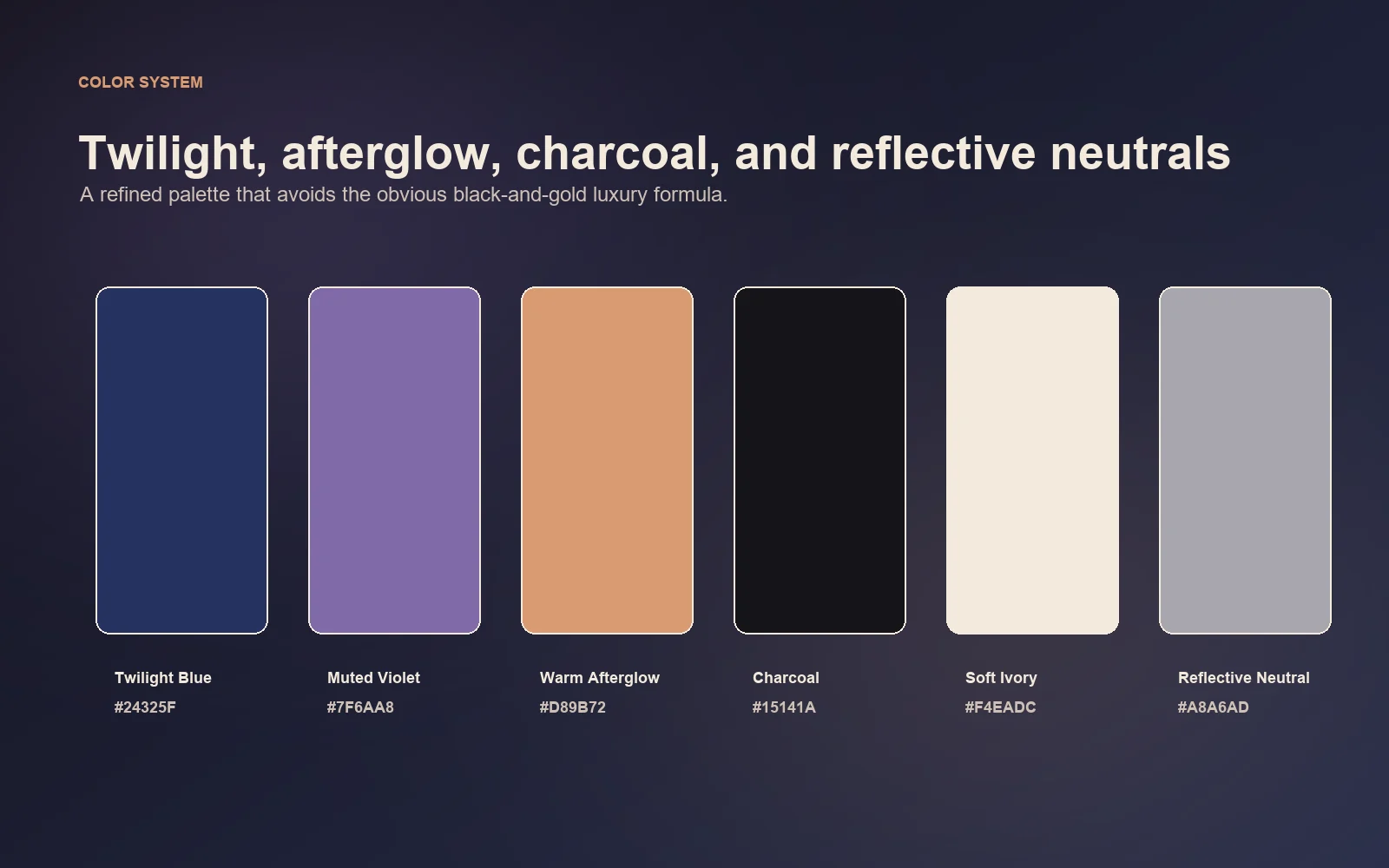
The palette is built around twilight blue, muted violet, warm afterglow, charcoal, soft ivory, and reflective neutral accents.
Packaging System
Art Direction and Campaign
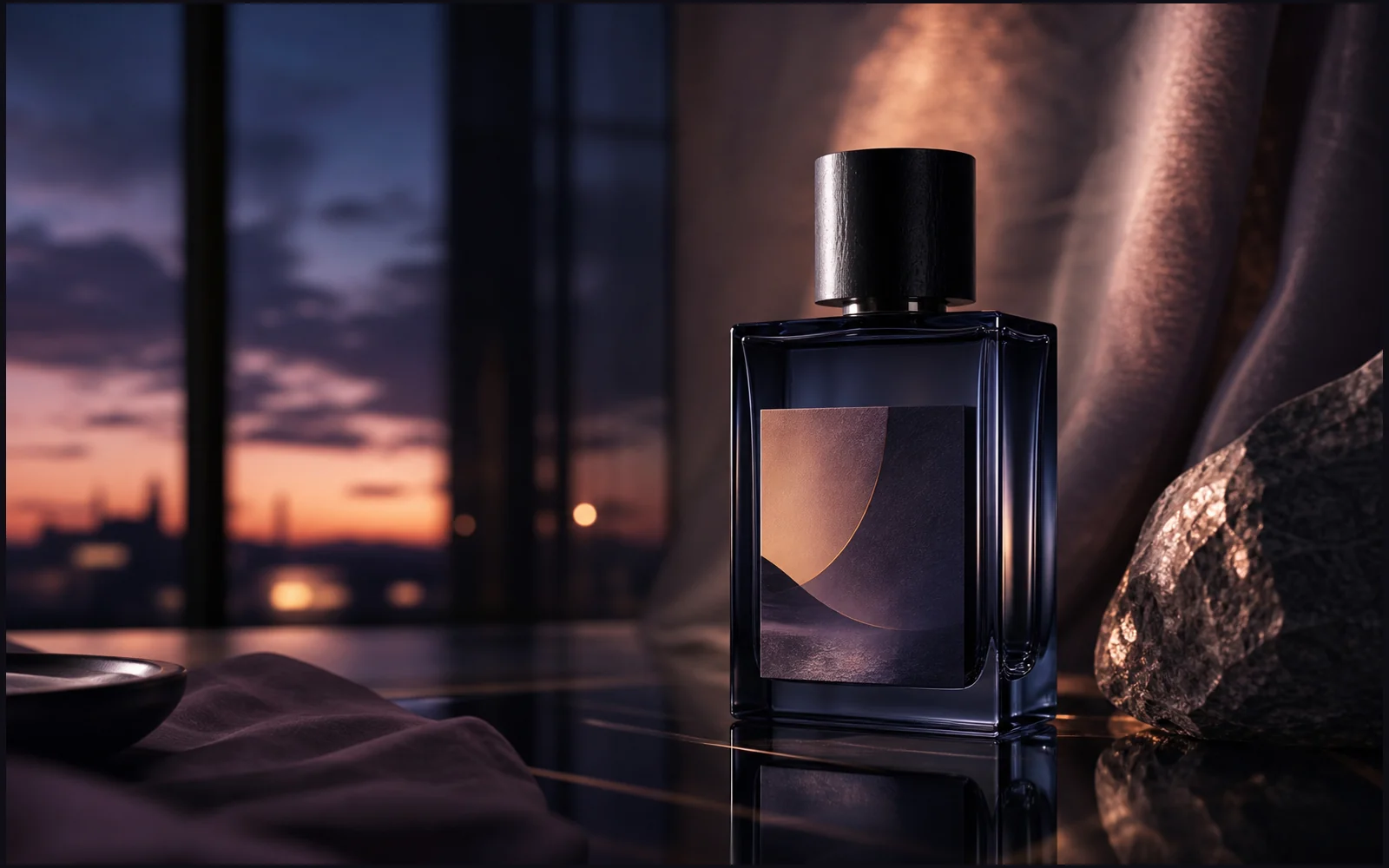
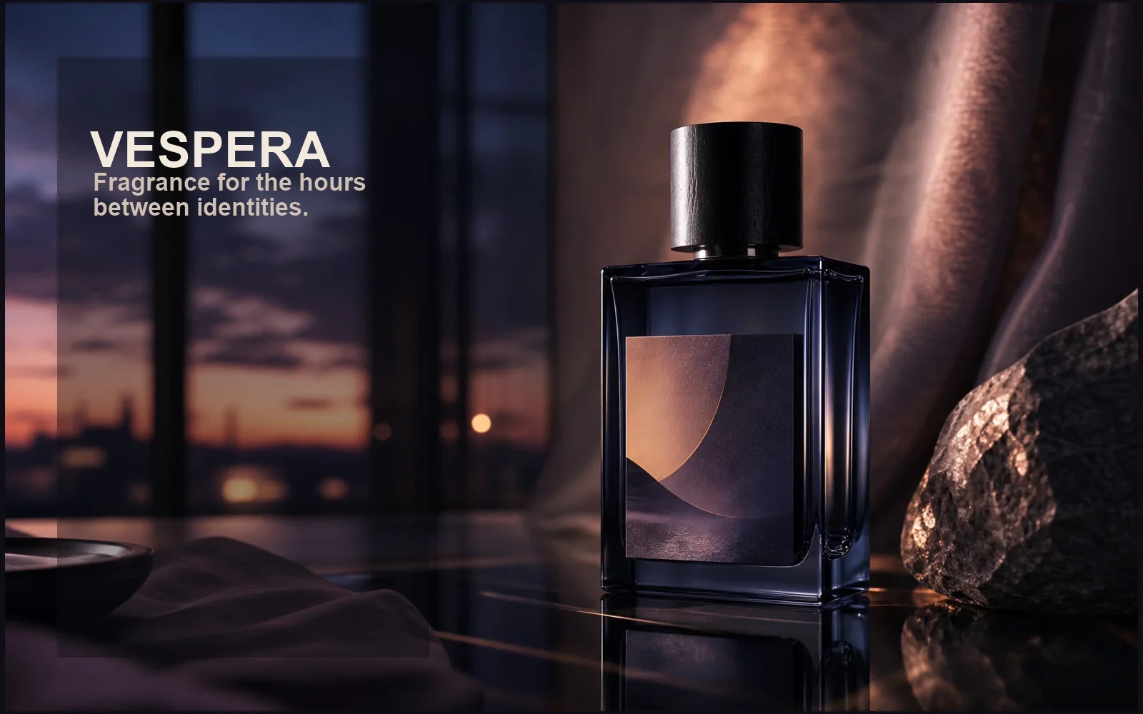
The campaign imagery should use reflective surfaces, soft shadow, transitional gradients, close-up material photography, controlled mist, minimal compositions, cinematic lighting, and a balance between warmth and darkness.

Digital Applications
Process and Exploration
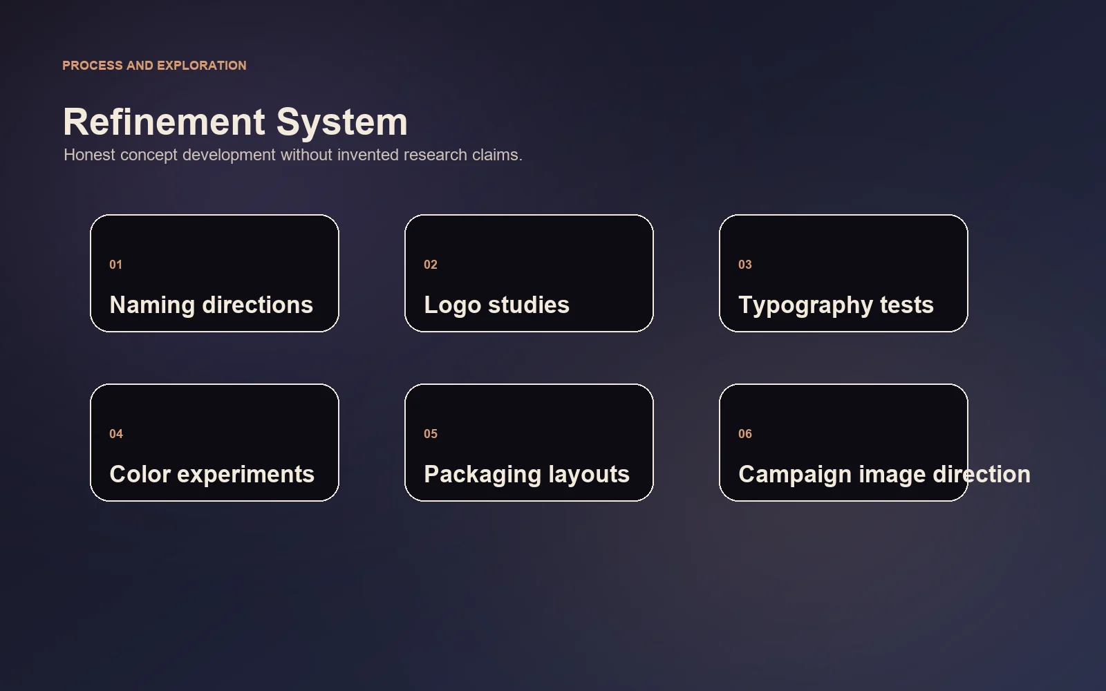
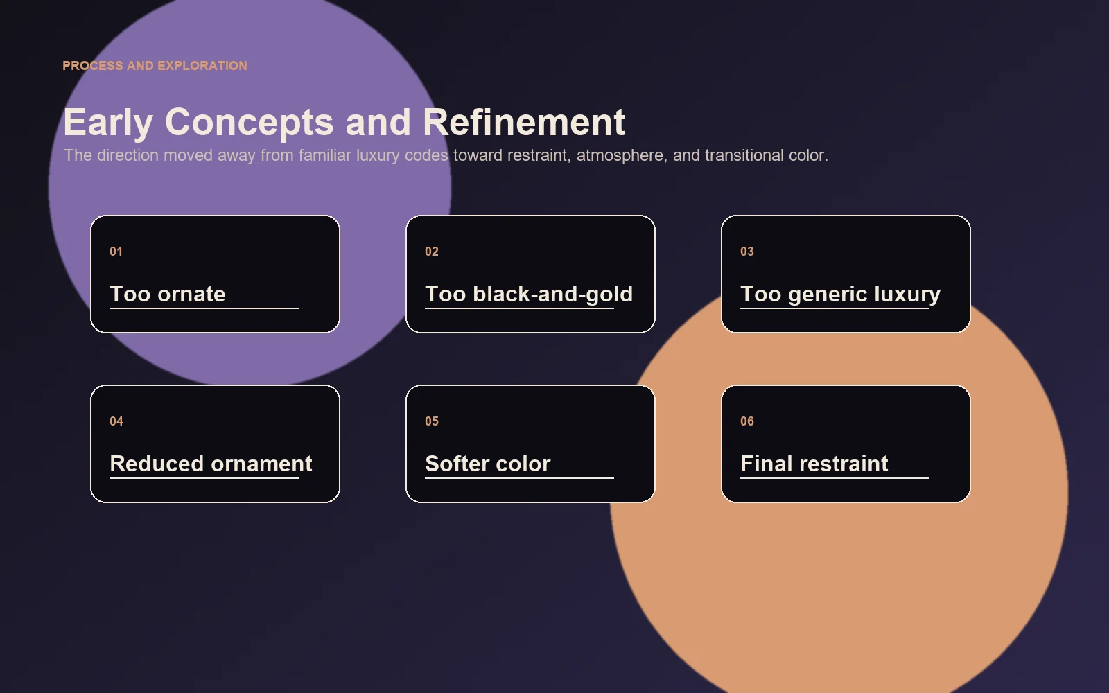
The early visual explorations leaned too heavily on familiar luxury cues. The direction was refined by reducing ornamentation, introducing softer transitional colors, and allowing typography, materials, and lighting to communicate sophistication more subtly.
Final System
The final system remains consistent through wordmark, monogram, typography, color, packaging, photography, layout, and digital presentation.
Outcome
The project resulted in a complete and reusable brand system applied across identity, packaging, campaign imagery, social media, and digital-commerce concepts. It demonstrates how a single creative idea can be translated into a coherent visual experience across physical and digital touchpoints.